What is contrast in photography? How strong and soft contrast change the story of an image
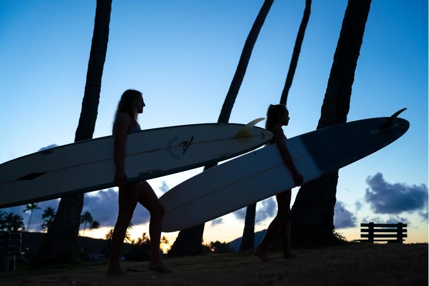
Photograph the same city street at noon and again under thick cloud, and you will end up with two very different pictures. At midday, hard shadows slice across the pavement and every edge looks crisp; under cloud, the scene settles into gentle, even tones. The difference is contrast, and learning to see and control it is one of the most useful skills in photography. This guide explains the meaning of contrast, the four main types, how its strength shapes mood and the practical ways to adjust it, with examples from portraits, landscapes and street snaps.
The meaning of contrast in photography
The meaning of contrast in photography
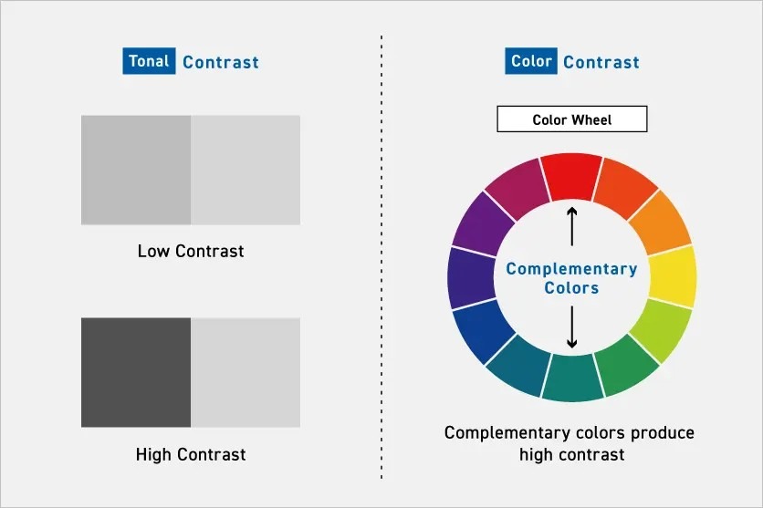
Contrast in photography has two related meanings. In its technical sense, it describes the difference between light and dark tones, and between colours, within an image. A frame with deep blacks and bright whites has high contrast; one where most tones sit close together has low contrast.
In a broader, compositional sense, contrast means placing different elements side by side so that each emphasises the other: rough beside smooth, old beside new, bright beside dark. Used well, both kinds of contrast add depth and presence to a subject, bring out texture and help communicate what the photographer wanted to say.
Four types of contrast in photography
Photographers generally work with four types of contrast. Each produces its own effect, and they are at their most powerful when combined.
Brightness contrast (tonal contrast)
Brightness contrast (tonal contrast)
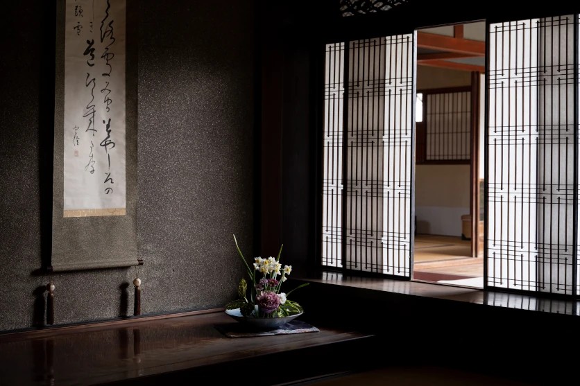
TAMRON 17-70mm F2.8 (Model B070) Focal length: 37mm Exposure: F4 Shutter Speed: 1/45sec ISO: 400
When photographers talk about contrast, they usually mean brightness contrast: the range of tones from white through grey to black. Picture a portrait taken in the shade of a stoep, with a sunlit garden behind. Soft daylight falls across one side of the subject’s face while the other side eases into shadow, and that gentle tonal shift gives the face shape and presence. The example here was shot at 37mm on an APS-C lens, equivalent to around 56mm in full-frame terms.
You can influence brightness contrast through exposure, through the direction and strength of the light, and later in editing software. Weather plays a big part too. Harsh midday sun on the Highveld produces strong contrast with deep, hard-edged shadows, while the humid haze common along the KwaZulu-Natal coast diffuses sunlight and softens the whole scene.
Reflectors and flash give you further control. A reflector bounces light into shadows to reduce contrast, while a single flash placed to one side can increase it.
Colour contrast and complementary colours
Colour contrast
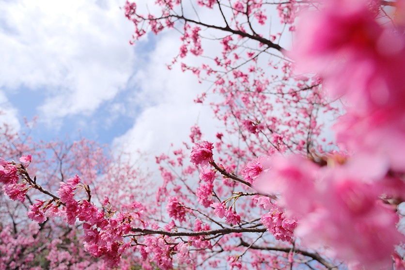
TAMRON 11-20mm F2.8 (Model B060) Focal length: 11mm Exposure: F2.8 Shutter Speed: 1/6400sec ISO: 640
Colour contrast comes from the relationship between different hues. The strongest pairings are complementary colours, which sit opposite each other on the colour wheel, such as red and green, blue and orange, or purple and yellow. Placed together, each makes the other look more intense. Pink protea flowers against the green of surrounding fynbos show this clearly, as do orange aloe flowers set against a clear blue Highveld winter sky. This example was captured at 11mm on an APS-C lens, around 16.5mm in full-frame terms.
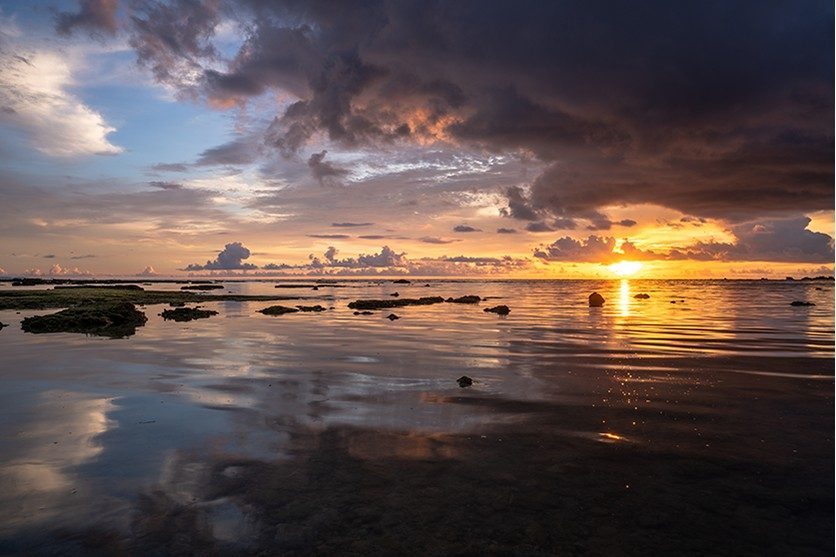
Pairing warm colours such as red, orange and yellow with cool blues and greens is another reliable approach. An Atlantic sunset reflected across the sea, with warm sky meeting cool water, has an immediate emotional pull. Train yourself to notice these natural pairings, as they can turn an ordinary scene into a memorable one.
Texture contrast: smooth against rough
Texture contrast
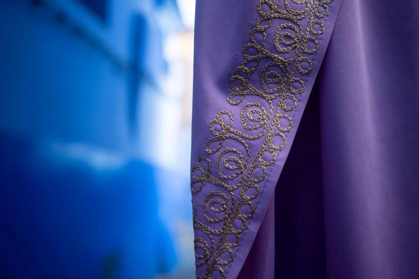
TAMRON 28-200mm F2.8-5.6 (Model A071) Focal length: 28mm Exposure: F2.8 Shutter Speed: 1/200sec ISO: 100
Texture contrast highlights differences in surface quality. Smooth, rounded pebbles resting on rough, weathered rock along the Cape coastline are a classic example, as are soft fabric draped over coarse woven material, or polished glass beside rusted metal. Setting contrasting surfaces together makes each more tangible, so viewers can almost feel them.
Light direction is essential here. Low side light casts tiny shadows across rough surfaces and lets smooth ones catch clean highlights. You can work close with a lens that focuses closely, as in this 28mm example (about 42mm equivalent on APS-C), or use a macro lens to isolate fine surface detail.
Contextual contrast: meaning within the frame
Contextual contrast

TAMRON 28-200mm F2.8-5.6 (Model A071) Focal length: 28mm Exposure: F5.6 Shutter Speed: 1/125sec ISO: 50
Contextual contrast is the most conceptual type, drawing on what subjects mean rather than how they look. Early 20th-century buildings standing beside glass towers in Johannesburg’s CBD, a single wildflower pushing up through paving, or a person surrounded by the objects of their everyday life all carry this kind of contrast. Beyond their visual interest, such images can suggest the passing of time or the relationship between people and their surroundings.
Success depends on choosing the right subject and background, and on careful composition. How you position the contrasting elements, the light you shoot in and how close you stand all shape the story the photograph tells. This frame was taken at 28mm (around 42mm equivalent on APS-C). Combining contextual contrast with brightness or colour contrast makes the message even stronger.
High vs low contrast in photography: how strength changes the mood
The strength of brightness contrast has a direct effect on mood, and the two ends of the scale produce very different results.
What is high contrast? Photos with bold light and shadow
High contrast
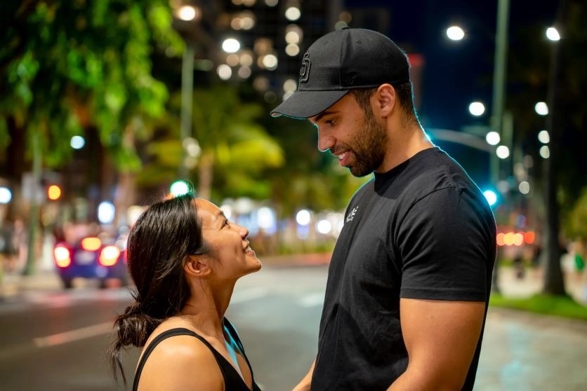
TAMRON 28-75mm F2.8 G2 (Model A063) Focal length: 75mm Exposure: F2.8 Shutter Speed: 1/10sec ISO: 1600
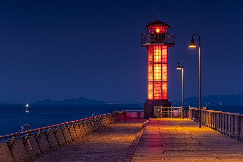
High contrast means a wide gap between the brightest and darkest areas of an image. Photos with high contrast feel bold, tense and dramatic. Lamps glowing along Durban’s beachfront promenade at dusk, set against a darkening sky, create exactly this effect, as does a portrait lit by a single hard light source that throws half the face into deep shadow. This example was captured at 75mm (around 112mm equivalent on APS-C).
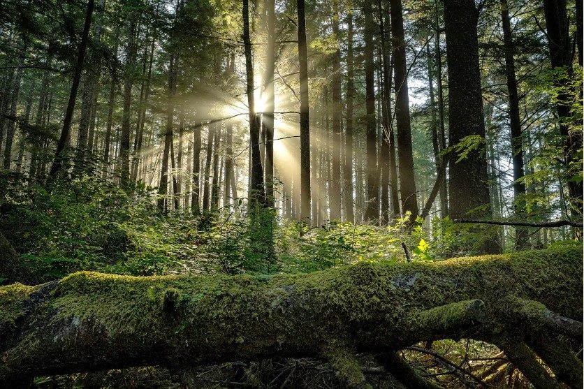
Nature offers high contrast too. Sunlight breaking through a tree canopy to spotlight individual branches against shaded foliage makes a lively, energetic image. Beyond visual impact, strong contrast can convey emotions ranging from vitality to isolation.
Low contrast photos: soft, dreamy and calm
Low contrast
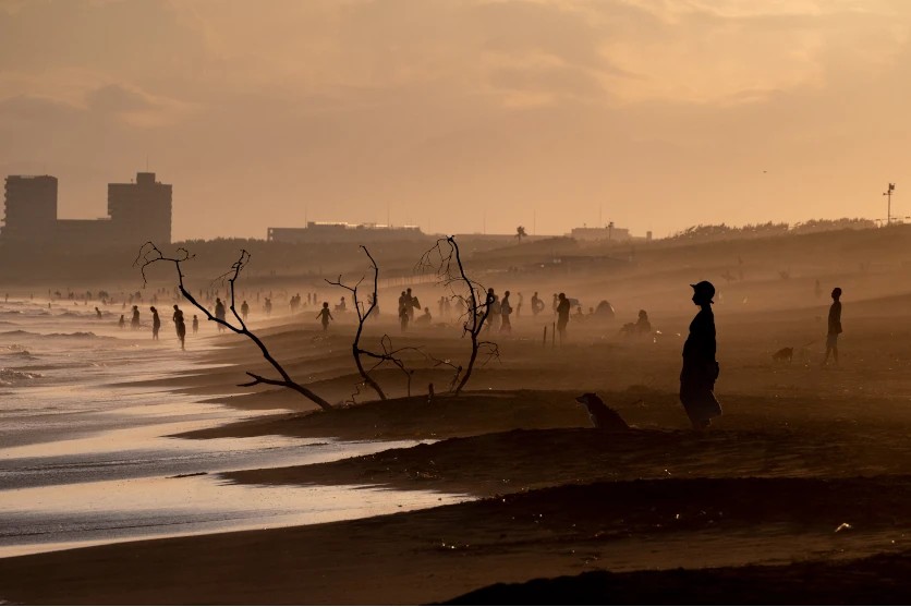
TAMRON 70-300mm F4.5-6.3 (Model A047) Focal length: 300mm Exposure: F14 Shutter Speed: 1/6400sec ISO: 2500
Low contrast photos have only a small difference between light and dark areas, and they tend to feel soft, peaceful and quiet. Mist lying in the valleys of the Drakensberg at dawn is a perfect subject, with ridges fading into pale layers. Scenes like this produce low contrast dreamy photos with a gentle, poetic atmosphere. The example was shot at 300mm (around 450mm equivalent on APS-C), a focal length that compresses distant layers of haze.
Low contrast is equally valuable in portraiture. The soft light of an overcast day wraps gently around a face, making it easier to capture subtle changes of expression and the natural texture of skin.
Contrast in photography vs tonal gradation
Tonal gradation is often discussed alongside contrast in photography, but the two describe different things. Contrast is the difference between the brightest and darkest parts of an image. Tonal gradation describes how smoothly the image moves between those extremes, through all the intermediate greys and shades. Gradation matters most in skies, skin and mist, where abrupt steps between tones are immediately noticeable.
The best photographs balance the two: enough contrast to give the image punch, and enough gradation to keep transitions smooth and natural, so the scene retains a real sense of atmosphere. Lenses play a part as well. A lens with strong contrast rendering, as shown in its MTF chart, reproduces fine detail with clarity, while good optical design helps preserve subtle gradations from highlights to shadows.
How to control contrast in photography
Contrast is not fixed by the scene. Light, timing, exposure, composition and editing all give you ways to shape it to suit your intention.
Work with the direction of light
Front light, coming from behind the camera, illuminates the subject evenly and reveals fine detail, but its lack of shadow flattens form. Side light rakes across the subject, creating shadows that emphasise shape. In portraits it sculpts the contours of the face, and in architecture it brings out structure and materials.
Backlight arrives from behind the subject, tracing outlines and creating silhouettes, though it can hide detail on the side facing the camera. Because each direction changes where shadows fall, even a small change of angle can transform the contrast in a scene. Three-quarter light, falling between front and side, is a useful middle ground, adding modelling to a face without deep shadows.
Choose your time of day
Sunlight changes in strength and quality throughout the day. In the early morning, the low sun and atmospheric scattering produce soft light with gentle contrast. By midday on a clear day, light is at its hardest and contrast at its highest, while cloud cover softens everything.
Golden hour, around sunrise and sunset, brings warm, low light that works beautifully for backlit scenes. Blue hour follows sunset, when the sky takes on cool, even tones. At South African latitudes the blue hour is relatively brief, often lasting only 20 to 30 minutes, so be in position early. In Cape Town in December, for example, the sun sets close to 19:55 SAST. Combining the right direction of light with the right time of day lets you set the mood precisely.
Use exposure to shape contrast
Exposure compensation does not change contrast directly, but it shifts where tones fall, which changes how contrast appears. Brightening the exposure lifts shadow detail and produces a light, airy look, though bright areas may lose separation as they approach pure white. Darkening it deepens the shadows and makes bright areas stand out more strongly, giving a calmer, heavier mood.
You can also depart from the metered exposure on purpose. A deliberately bright high-key image or a dark, moody low-key frame can be far more expressive than a technically correct one. Check the histogram as you go: a graph bunched in the middle signals low contrast, while one pressed against both edges shows high contrast that may be losing detail.
Build contrast into your composition
Composition gives you further control. A scene that grows gradually lighter from foreground to background creates a natural sense of depth, while an uneven balance of light and dark across the frame can add movement or tension. A shaded foreground framing a sunlit middle distance works in the same way.
Pay attention to the relationship between subject and background, too. A dark subject against a bright background, or the reverse, stands out immediately. Foundational techniques such as the rule of thirds, symmetry and diagonal lines help you place these tonal contrasts where they will have the most impact.
Contrast photo editing: refine without overdoing it
Contrast photo editing starts with basic brightness and contrast adjustments. From there, dodging and burning let you lighten or darken selected areas, and a tone curve gives separate control over highlights, midtones and shadows. Colour grading adds a further layer, shifting the hues within each tonal range. Shooting in RAW gives you the most room for all of these adjustments.
Restraint matters. Overly contrasted photos look fake because heavy adjustments crush shadows into solid black, clip bright skies to white and create glowing halos along edges. Increase contrast in small steps, check the histogram and compare with the original before you finish.
Using contrast in photography across different scenes
The final step is applying these ideas to real subjects. Here is how contrast works in three popular types of photography.
Portraits: soft or sculpted
Portraits
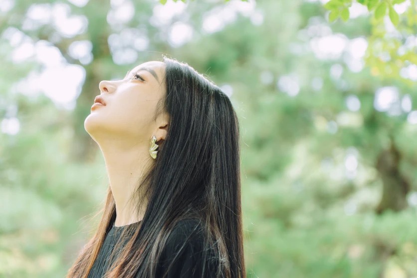
TAMRON 17-70mm F2.8 (Model B070) Focal length: 70mm Exposure: F2.8 Shutter Speed: 1/125sec ISO: 160
For a gentle, flattering portrait, keep contrast low. Soft light renders skin texture naturally and suits relaxed, warm expressions. A wide aperture that blurs the background helps the subject stand out without the need for harsh light. The example was shot at 70mm on an APS-C lens, equivalent to around 105mm in full-frame terms.
For more drama, use side light to deepen the shadows on one side of the face. The result feels intense and sculptural, but take care: pushed too far, it can make a portrait look harsh or severe.
Landscapes: layering depth
Landscapes
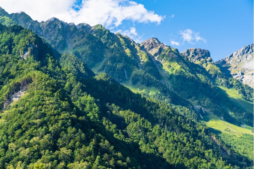
TAMRON 28-75mm F2.8 G2 (Model A063) Focal length: 75mm Exposure: F8 Shutter Speed: 1/250sec ISO: 100
Contrast between foreground and distance is one of the most effective ways to give a landscape depth. Ridgelines in the Winelands often recede into haze, each layer paler than the one in front. This effect, known as aerial perspective, makes a darker foreground and lighter distant hills read naturally as depth. This example was taken at 75mm (around 112mm equivalent on APS-C).
For trees, buildings or other structures with strong outlines, side light or backlight can create striking silhouettes. A windpump on a Karoo farm, silhouetted against a warm sunset sky, makes a simple but powerful contrast.
Street snaps: light and shadow in the city
Snaps
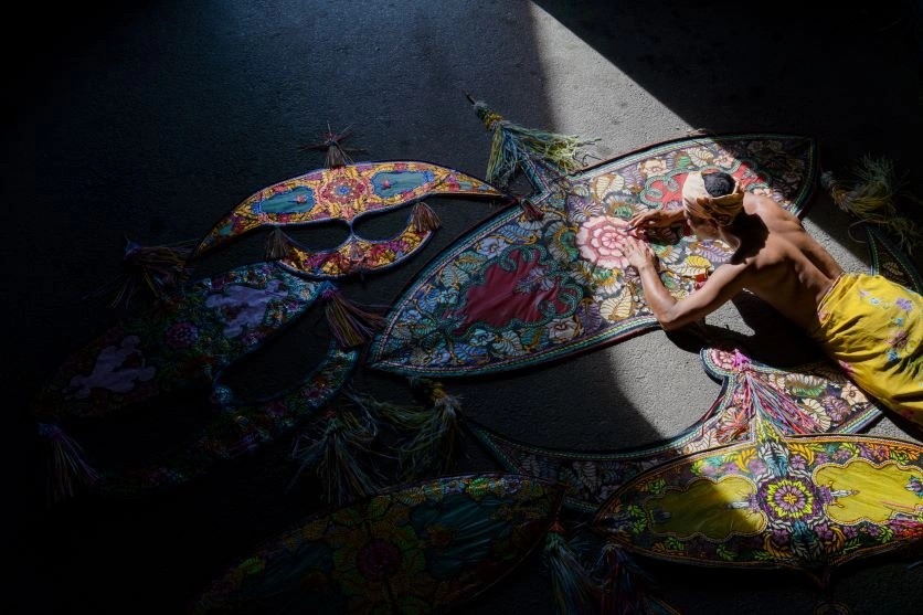
TAMRON 28-200mm F2.8-5.6 (Model A071) Focal length: 35mm Exposure: F8 Shutter Speed: 1/250sec ISO: 100
In street snaps, light and shadow can turn everyday moments into something more dramatic. In Johannesburg’s CBD, late-afternoon sun slanting between tall buildings throws bold shadow patterns across streets and pavements. Look for strong shapes in the shadows themselves, such as railings, stairways or window frames stretched across a wall. This frame was captured at 35mm (about 52mm equivalent on APS-C).
Bright sun by day and strong artificial light at night both leave highlights prone to blowing out, so dial exposure compensation towards the negative side. Exposing for the highlights, the core idea behind highlight photography, keeps bright areas detailed while shadows fall away into rich darkness.
Backlit silhouettes are also rewarding in street photography. Whether the shape belongs to a building or a passer-by, shadow and contrast can turn an ordinary scene into a striking composition.
Making contrast in photography work for you
Contrast in photography is far more than the gap between light and dark. Brightness, colour, texture and context each offer their own way of drawing attention and telling a story, and the strength of contrast sets the mood, from bold and dramatic to soft and dreamy. Try a simple exercise: photograph the same scene at midday and again at golden hour, then compare how the light has changed. Experimenting with light, timing and composition in this way is the quickest route to discovering what contrast can do for your images.