What Is White Balance? Colour Temperature Explained, and How to Use It Creatively
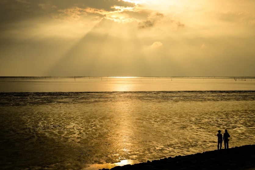
The same subject photographs as a different colour depending on what is lighting it. A white wall recorded at midday, again in open shade, and again under the lights inside a house will come back as three different colours, even though you saw one wall all day. Your eyes corrected for the light without asking you; the camera did not. White balance is the control that performs that correction, and once you understand it, the same control becomes one of the more useful creative tools on the camera. This article covers what white balance is, how colour temperature works, what each preset does, and how to use both deliberately.
What is white balance?
Human vision has a property called colour constancy. A white gable wall in the Bo-Kaap reads as white at eleven in the morning and still reads as white at six in the evening, even though the light falling on it has shifted dramatically towards orange. Your visual system discounts the light source and reports the surface.
A camera does no such thing. The sensor records the light that reaches it, including whatever colour that light happens to be, and the result carries a cast: orange under household lighting, blue in shade, green under older office tubes.
White balance is the correction. It tells the camera what colour the light is, so the camera can compensate and render neutral surfaces as neutral. That is its primary job, and for most photography it is the only job you need it to do.
Its second job is the interesting one. Because white balance shifts the entire colour rendering of a frame, deliberately setting it away from accurate gives you direct control over whether an image reads warm or cool. That is not a mistake to be avoided. It is a decision worth making on purpose, and the second half of this article is about making it well.
Colour temperature and white balance: the Kelvin scale
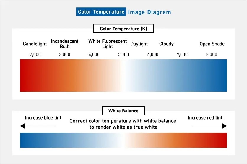
White balance colour temperature is measured in Kelvin, written K. The scale describes the colour of light by reference to the colour a theoretical black body radiates when heated to that temperature, which is why the numbers run from red at the bottom to blue at the top.
Useful anchor points: candlelight sits near 1,900K, household filament and warm LED lighting around 2,700 to 3,000K, older office tubes near 4,000K, direct midday sunlight around 5,500K, overcast skies around 6,500K, and open shade under a clear blue sky as high as 8,000K. The higher the number, the bluer the light.
Here is the part the numbers hide, and it is the single thing that trips people up. The colour temperature of the light and the colour temperature you set on the camera work in opposite directions.
When you dial a higher Kelvin value into the camera, you are telling it the light is blue. The camera compensates by adding warmth, and the image comes out warmer. Set 8,000K and you get an orange-leaning picture. Set 3,000K and you are telling the camera the light is orange, so it adds blue, and the picture comes out cooler.
So: higher K light equals bluer light, but a higher K setting equals a warmer photograph. Read the two statements as describing different things, because they do. Once that clicks, every creative white balance decision in this article becomes predictable rather than a matter of trial and error.
There is a second axis that the Kelvin number does not describe at all. Colour temperature runs from orange to blue; a separate axis runs from green to magenta, usually labelled tint. Some light sources, notably fluorescent tubes and certain LEDs, throw a green cast that no Kelvin value will fix, because green is not on the Kelvin scale. Most cameras and every RAW converter expose both controls, and knowing that the second one exists saves a great deal of pointless adjustment of the first.
White balance settings on your camera
Every interchangeable-lens camera offers the same three approaches to white balance adjustment: leave it automatic, choose a preset white balance matched to the light, or set a value yourself.
The presets below each correspond to a fixed Kelvin value. What is less widely known is that almost every camera also lets you enter a Kelvin figure directly, usually somewhere between 2,500K and 10,000K, in increments of 100K. That direct entry is more precise than any preset and is the setting to use once you know which direction you want to move.
There is also custom white balance, which is the most accurate method available and the one most photographers never try. You photograph a neutral reference — a proper grey card, or at a pinch a sheet of white paper or the unprinted back of a receipt — under the light you are working in, then tell the camera to use that frame as its reference. The camera measures the actual light rather than guessing at it. It takes about twenty seconds, it handles mixed and awkward lighting that defeats every preset, and it is the right answer for product work, interiors, and any situation where colour has to be correct rather than merely plausible. Reset it when you move to different light, because a custom reference is only valid for the conditions it was taken in.
Auto white balance (AWB)
Auto white balance analyses the scene, estimates the colour of the light, and corrects accordingly. Modern implementations are good, and for a large share of everyday shooting AWB is the sensible default. Outdoors in reasonable light, indoors under a single type of lighting, and for anything fast-moving where you have no time to think about colour, it will be close enough.
It fails in two predictable situations. The first is mixed lighting: a person seated near a window in the late afternoon is lit by warm interior lighting on one side and cool daylight on the other, and there is no single correction that serves both. The camera picks one and the other goes wrong. The second is a scene dominated by one colour. Photograph a field of orange at sunset and AWB may read the orange as a cast to be removed, neutralising the very thing you were photographing.
Both cases are what custom white balance and direct Kelvin entry are for. In mixed light, set a custom reference from the light falling on your actual subject and let the rest of the frame go where it will. In a strongly coloured scene, switch off the automation entirely and dial a fixed value, so the camera stops changing its mind between frames.
Daylight
Daylight white balance is fixed at roughly 5,200 to 5,500K, matching direct sunlight. It is the preset to use outdoors in clear conditions, and it renders sky, foliage and skin close to how they looked.
Its real value is consistency. Because it is a fixed value, it does not shift between frames as your framing changes, which matters when you are shooting a sequence that has to match. AWB will happily give you eight slightly different colour renderings of the same scene across eight frames; Daylight gives you eight identical ones.
It is also the honest starting point for sunrise and sunset work. Daylight balance records warm light as warm, which is usually what you want, whereas AWB will try to correct the warmth away and hand you a neutral sunset, which is no sunset at all.
Shade
Shade sits around 7,500 to 8,000K and corrects the blue cast that appears when a subject is lit by open sky rather than by the sun directly.
The cause is not obvious until you think about it. Step into the shadow of a building or under a tree on a clear day and the sun is no longer your light source — the blue sky is. That light is genuinely blue, so the camera adds substantial warmth to compensate.
It is the preset for portraits made in shade on a bright day, where it restores natural skin tones that would otherwise come out cold and slightly grey. It also suits dappled light under trees, where patches of direct sun and patches of sky-lit shade sit side by side in the same frame.
Because Shade applies the strongest warming of any preset, it doubles as a creative tool. Used deliberately in conditions that do not call for it, it pushes an image warm, which is the basis of several techniques later in this article.
Cloudy
Cloudy white balance sits around 6,000 to 6,500K, between Daylight and Shade, and adds a gentle warmth that offsets the slight coolness of overcast light.
Overcast conditions are more common here than the sunshine reputation suggests — the Cape through winter, the KwaZulu-Natal Midlands most mornings in the cooler months, and the Highveld ahead of a summer storm. The light is soft and even, which suits close work and portraits, but it renders slightly flat and cool if left uncorrected.
The preset suits strongly coloured subjects particularly well. Fynbos and protea close-ups, flowers generally, and foliage all gain a little saturation from the modest warming, without the correction becoming obvious the way Shade can in the same conditions.
Incandescent (Tungsten)
Incandescent white balance sits around 3,000K and corrects the heavy orange cast of filament bulbs by adding blue.
It remains relevant even though filament bulbs are largely gone, because warm-white LED lighting is deliberately manufactured to imitate them and sits in the same 2,700 to 3,000K range. Domestic interiors, restaurants and most hospitality lighting land here.
Food photography is where it matters most. Warm interior lighting flatters a room and does no favours at all to a plate, pushing everything yellow — a koeksister looks syrupy rather than golden, and anything pale reads as stale. Incandescent balance recovers the actual colour of the food.
Note that this preset applies the strongest cooling of any on the dial, which makes it the natural partner to Shade for creative work. Where Shade pushes an image warm, Incandescent pushes it cold, and several of the scene techniques below depend on exactly that.
Fluorescent
Fluorescent white balance sits around 4,000K and targets the light in offices, retail floors, workshops and older public buildings.
The complication is that the problem with fluorescent light is only partly a colour temperature problem. Tubes emit a spiky, uneven spectrum with a pronounced green component, and green does not sit on the Kelvin scale at all. It lives on the separate green-to-magenta tint axis. A fluorescent preset applies a magenta shift alongside its colour temperature setting, which is why it works where a plain Kelvin value does not.
LED lighting, which has replaced fluorescent across most new installations, needs mentioning because it behaves differently again. LED output varies enormously between fittings, from warm 2,700K domestic lamps to cold 6,500K commercial panels, and cheaper units produce spectra that no single Kelvin figure describes well. Two fittings in the same room can differ visibly. Under mixed or unfamiliar LED lighting, a custom white balance reference is far more reliable than any preset, and shooting RAW leaves you the option of fixing it afterwards.
White balance for different scenes
White balance is not only for making white things white. Once accurate rendering is within reach, deliberately choosing something other than accurate is where the control earns its keep. The scenes below are the ones where that choice changes an image most.
Blue hour and early morning
The cool light before sunrise, held cool rather than corrected towards neutral
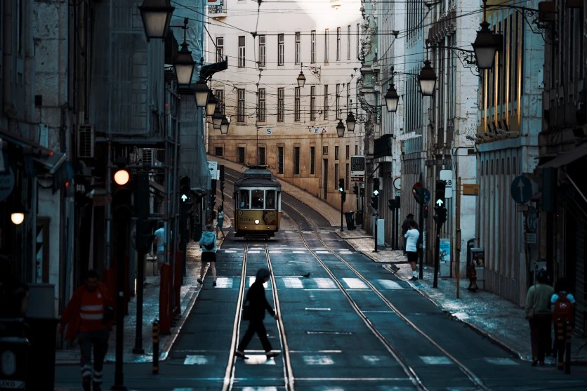
TAMRON 50-300mm F4.5-6.3 (Model A069) Focal length: 300mm Exposure: F6.3 Shutter Speed: 1/100sec ISO: 160
Blue hour is the period when the sun is below the horizon but the sky is still lit, and it happens twice a day — before sunrise and again after sunset. The light is genuinely blue, because the sky is the only source, and it changes quickly.
The sunrise white balance decision is whether to keep that blue or remove it. AWB will remove it, neutralising the exact quality that made you get up. Set Daylight to record the scene roughly as it looks, or go further and set Incandescent or a direct value around 3,200K to deepen the blue into something colder and stiller than the eye saw.
This pairs naturally with exposure. Holding the frame a third to a full stop below the meter, alongside a cool white balance, produces the quiet, contained feeling of a Highveld dawn before anything has started moving. A Durban beachfront sunrise handles the same treatment, with the added benefit of water to carry the colour.
At 300mm, roughly 450mm equivalent on an APS-C camera, a long lens compresses a distant horizon into a narrow band of graduated colour. That focal length handheld at 1/100 second relies on stabilisation — Tamron's system is branded VC, or Vibration Compensation, and comparable implementations exist elsewhere — though a tripod is better in light this low.
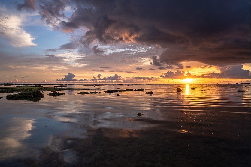
Sunset and magic hour
Warm evening light, with the white balance set to preserve it rather than correct it
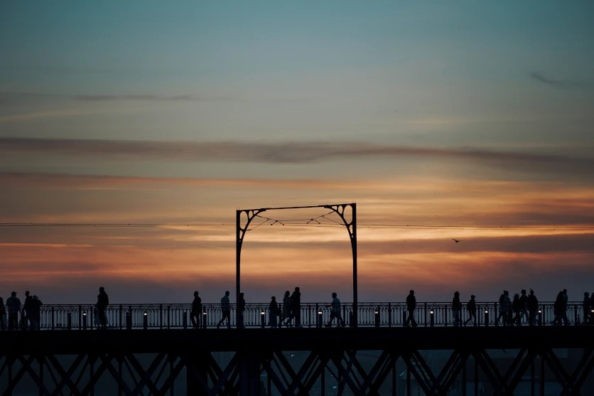
TAMRON 50-300mm F4.5-6.3 (Model A069) Focal length: 248mm Exposure: F6.3 Shutter Speed: 1/250sec ISO: 200
The hour before sunset gives light with a colour temperature that falls steadily from around 4,500K down towards 3,000K as the sun drops. It is the most forgiving light of the day and the most rewarding to photograph.
Sunset white balance comes down to one decision, and it is the same one as at dawn, inverted. AWB will read the warmth as a cast and try to remove it. Do not let it. Daylight balance preserves the warmth as it was; Shade, at 8,000K, or a direct value around 7,500K pushes it considerably further, deepening oranges and reds into something more emphatic than the scene actually offered.
The opposite move is available and underused. Setting a low value, around 4,000K, against a warm sky cools the whole frame and turns a conventional sunset into something colder and more graphic. It suits a hard horizon and strong silhouettes — an Atlantic seaboard skyline, or the ridge line above a Cape winelands valley.
Because the light changes by the minute, fix the white balance rather than leaving it automatic. A sequence shot on AWB across twenty minutes will be unusable as a set, since every frame will have been corrected differently. At 248mm, about 372mm equivalent on APS-C, you can work the sun itself as a compositional element rather than as a light source.
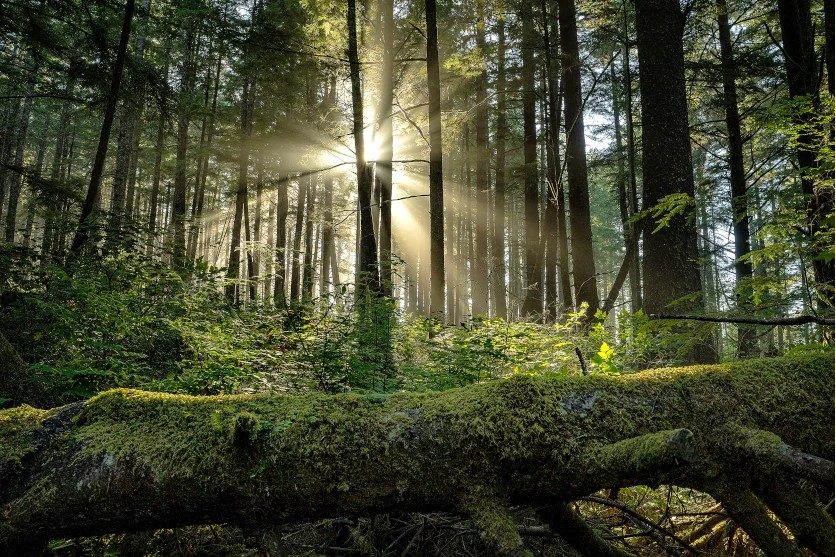
Autumn colour and seasonal foliage
Strongly coloured foliage, where the white balance setting decides how warm the scene reads
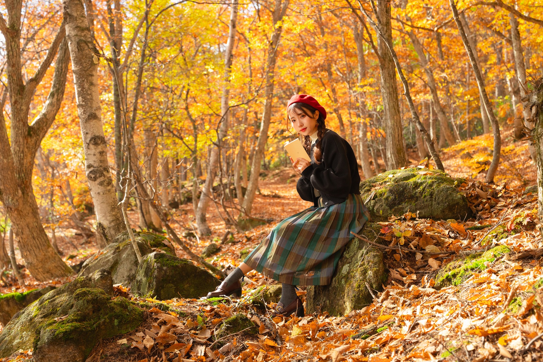
TAMRON 17-50mm F4 (Model A068) Focal length: 50mm Exposure: F4 Shutter Speed: 1/400sec ISO: 100
Foliage with strong colour in it is where white balance choice shows most clearly, because the subject is already sitting near one end of the colour axis and the setting either reinforces or fights it.
The oak avenues through the Cape winelands towns turn from late April into May, giving several weeks of yellow and copper. Daylight balance records them accurately. Shade, or a direct value around 7,000K, intensifies the warmth considerably and suits late afternoon light when the two effects compound. Pretoria's jacaranda canopy in October is the spring counterpart, and the purple responds differently — a warmer setting pushes it towards magenta, while a cooler one holds it blue, and the two readings are far enough apart to be worth testing before committing.
The cool direction is worth trying when mist is involved. Mist through the KZN Midlands in the cooler months, with a white balance around 4,000K, renders the scene blue and flattened, which suppresses the colour rather than celebrating it. That is a legitimate choice, and for a heavily coloured subject it is often the more interesting one.
At 50mm, about 75mm equivalent on APS-C, you get tight enough framing to fill the frame with canopy and avoid the sky, which otherwise forces a compromise on exposure that the white balance decision then has to work around.
Moon and night sky
A long exposure under a dark sky, with the white balance set rather than left automatic
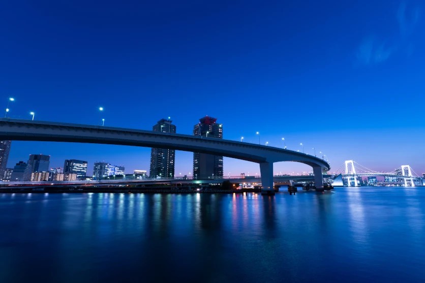
TAMRON 17-50mm F4 (Model A068) Focal length: 17mm Exposure: F11 Shutter Speed: 20sec ISO: 100
South Africa has some of the darkest accessible skies anywhere, and the Karoo is the obvious destination — clear, dry, high, and far enough from settlement that the sky reaches genuinely black.
Milky way white balance is a creative decision with no correct answer, which is why it is worth understanding rather than guessing. AWB is unreliable here because the frame is mostly black and there is nothing for the automation to reference. Set a value directly. Around 3,800 to 4,200K gives the cool blue-grey rendering most photographers expect, holding the dust lanes dark and the sky neutral. Around 5,000K warms it towards the yellow and brown that the galactic core actually shows. Below 3,500K the sky goes strongly blue, which reads as dramatic and is further from what is really there.
Light pollution complicates it. Sodium street lighting throws an orange glow across the lower sky that a cooler setting will partly suppress; LED street lighting throws a colder, harder glow that a warmer setting handles better. Which way you go depends on what is on your horizon.
The moon is a separate problem and gets treated wrongly more often than not. Moonlight is reflected sunlight, so Daylight balance renders the moon close to neutral, which is accurate. Incandescent balance turns it cold and blue, giving the clinical look that suits a moon isolated against black. A warmer setting around 6,500K gives the softer, slightly golden moon that suits it low in the sky against a landscape. All three are defensible; pick one and commit.
At 17mm, roughly 25mm equivalent on APS-C, you have wide enough coverage for the core and a foreground together, and the 20 second exposure sits just inside the limit before stars begin to trail.
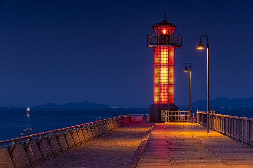
Night photography and mixed lighting
A city scene under mixed artificial lighting, where no single correction serves everything
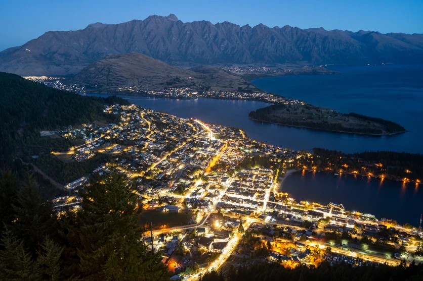
TAMRON 28-300mm F4-7.1 (Model A074) Focal length: 28mm Exposure: F4 Shutter Speed: 30sec ISO: 100
Night photography white balance is the hardest case, because an urban scene at night contains several light sources of quite different colours all at once. Older sodium street lighting runs strongly orange, newer LED installations run cold and blue-white, signage runs whatever colour it was designed to be, and vehicle lights add another layer again. No single setting corrects them all, and attempting to do so usually produces something worse than leaving it alone.
AWB copes reasonably well and is a fair starting point, as long as you accept that it will make different decisions across a sequence. Where consistency matters, fix a value instead. Around 3,800K neutralises sodium lighting while leaving LED sources cool. Around 5,000K splits the difference and keeps both casts visible, which often reads more honestly than a forced correction.
The deliberate moves are the interesting part. After a Highveld summer thunderstorm, when the streets are still wet and reflective, a cool setting around 3,200K pushes the whole scene blue and makes the reflections the subject. Going the other way, a warm setting around 6,500K amplifies the orange of older street lighting into something heavier and more enclosed — an effect that suits the Art Deco frontages around central Johannesburg, where the architecture and the lighting era match.
At 28mm, about 42mm equivalent on APS-C, and 30 seconds at F4, the exposure is long enough to smooth movement out of the frame entirely.
Adjusting white balance in RAW
A RAW file stores the sensor data along with the white balance value as a tag rather than baked into the image, which means colour temperature and tint can both be reset afterwards with no loss of quality whatsoever. This is not true of JPEG, where the correction is applied at capture and any later change works against an already-processed file.
That makes RAW the sensible choice whenever colour is uncertain or the lighting is awkward — mixed sources, unfamiliar LED fittings, fast-changing light at either end of the day, or any situation you cannot go back and reshoot.
It is not a reason to stop thinking about white balance at capture. Getting close in camera means you are judging the image on the back of the camera in roughly its final form, which affects the compositional and exposure decisions you make next. RAW gives you a safety net, not a substitute.
Getting the white balance you want
White balance tells the camera what colour the light is, so that neutral surfaces record as neutral. Colour temperature in Kelvin describes that light, with a separate tint axis handling the green and magenta casts the Kelvin scale cannot reach. Remember the inversion: a higher Kelvin setting produces a warmer photograph, not a cooler one.
A practical progression. Leave AWB on while you are learning, but shoot RAW so nothing is lost. Start fixing the value for anything where colour is the point — sunrise, sunset, foliage, night — because a fixed setting also gives you consistency across a sequence, which automation never will. Learn custom white balance for the situations where accuracy is required rather than desirable. Then start setting it wrong on purpose, because that is where it stops being a correction and becomes a decision.