| September 18, 2026
 South Africa's #1 Mobile Protection Brand
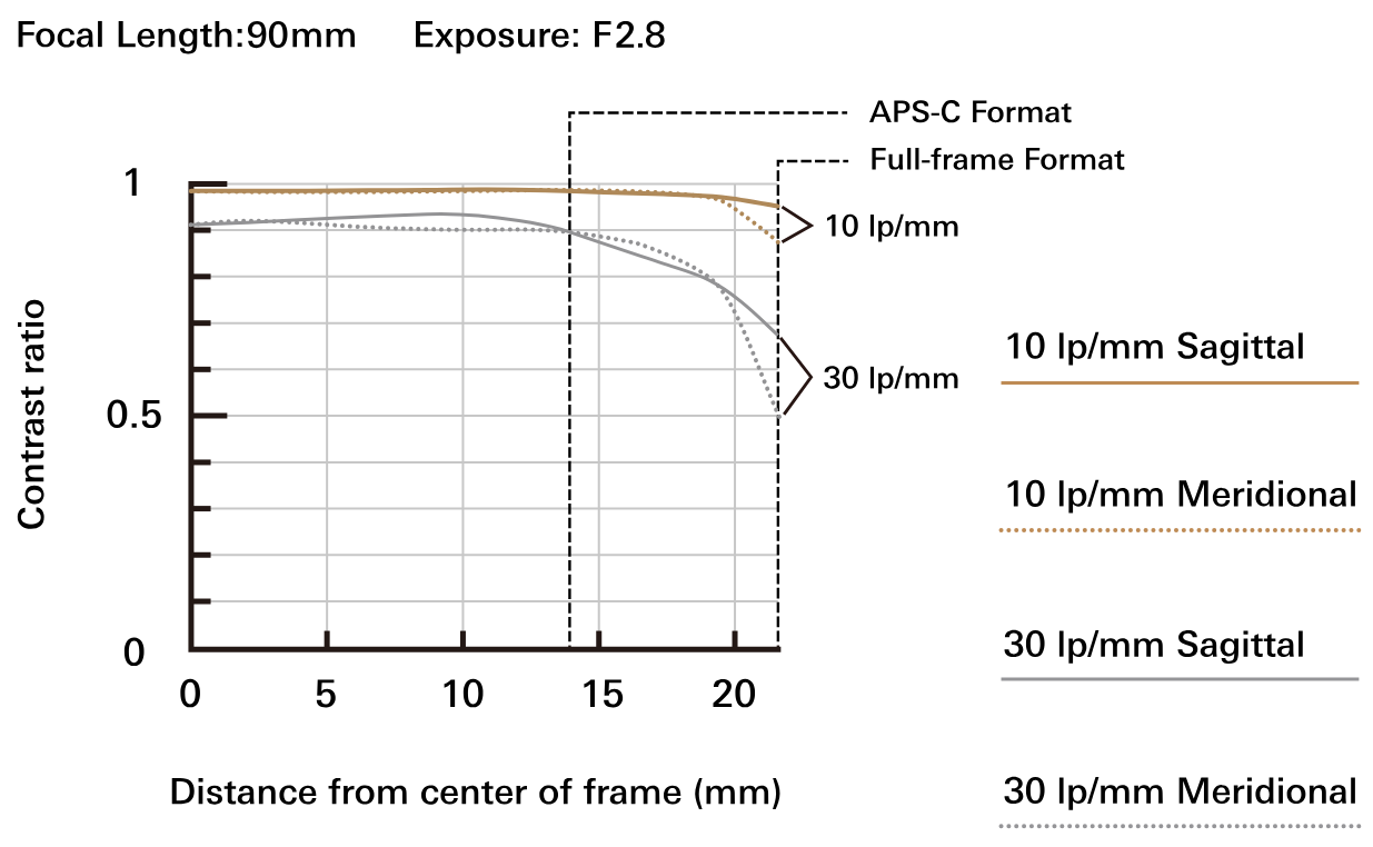
You are deciding between two lenses. Both product pages show a graph with a few curved lines running left to right, some numbers along the bottom, and nothing on the page explaining what any of it means. That graph is an MTF chart, and it is one of the few pieces of genuinely objective optical data a manufacturer publishes. Learning to read one takes about ten minutes and it will change how you compare lenses. This article covers what MTF measures, how to read the chart, and — just as importantly — what it cannot tell you.
MTF stands for Modulation Transfer Function. It is a measure of how faithfully a lens transfers the contrast of a subject into the image it projects.
Every lens loses some contrast. Point one at a pattern of crisp black and white lines and what emerges on the other side is never quite as crisp — the blacks lift slightly toward grey, the whites drop slightly, and the finer the lines, the more of that original contrast is lost. MTF puts a number on how much survives. A value of 1 means the contrast came through completely intact; a value of 0 means the lines have merged into uniform grey with no distinction left at all. Real lenses fall somewhere between.
It is worth being precise about what is being measured here, because the distinction matters: MTF is a property of the lens alone. It describes the optical image the lens projects, measured independently of whatever sensor might be placed behind it. Two photographers using the same lens on different cameras are working with the same MTF performance, even though their final images will differ.
Plot those values across the frame and you get a smooth curve. The horizontal axis is image height — the distance outward from the centre of the image, in millimetres — and the vertical axis is the MTF value itself. That graph is the MTF curve, and it is the standard way lens contrast and resolution are published.
MTF is not unique to photography. The same measurement is used to describe resolution across optics generally, including in scientific and medical imaging systems, which is why you may encounter the term well outside a camera context.
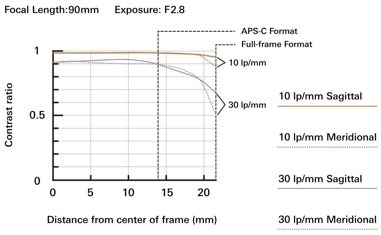
Graph of MTF against distance from the centre of the frame (image height) in millimetres
Once you know what the axes represent, the rest follows quickly.
Image height, made concrete. The horizontal axis runs from 0 at the centre of the frame outward toward the corner. The number that makes this legible is where the corner actually sits: on a full-frame sensor, the corner is at an image height of 21.6mm. On APS-C it is roughly 13 to 14mm depending on the exact sensor. So a chart running to 21.6mm is showing you performance from dead centre to extreme corner, and if you shoot APS-C, only the left two-thirds of that chart describes the part of the image circle you are actually using — which is one reason full-frame lenses often perform well on crop bodies.
What is being measured. MTF figures come from photographing a test pattern of alternating black and white lines at a specified fineness, then measuring how much of the original contrast remains in the projected image. The fineness of that pattern is the spatial frequency, expressed in lp/mm — line pairs per millimetre, where one pair is one black line plus one white line.
The two frequencies Tamron publishes. Charts show curves at 10 lp/mm and 30 lp/mm, and the two tell you different things.
The 10 lp/mm curve describes relatively coarse detail, and it is effectively a measure of contrast reproduction. A lens whose 10 lp/mm curve sits close to 1 produces images with strong, clean separation between tones — what photographers usually describe as clarity or punch.
The 30 lp/mm curve describes fine detail, and it is a measure of resolution. A lens whose 30 lp/mm curve sits high can hold small textures — individual hairs, the grain of a surface, distant foliage — that a weaker lens smears together. This is what people mean when they call a lens sharp.
A lens that holds high values at both frequencies is performing well overall. Strong at 10 but weak at 30 suggests a lens with good contrast that struggles with fine detail.
The two lines per frequency. Look at a real chart and you will see more curves than you expected, because each spatial frequency is plotted twice. One line is sagittal, measuring detail that runs radially outward from the centre of the frame like spokes on a wheel. The other is meridional, measuring detail running perpendicular to that, in concentric circles around the centre.
When those two lines sit close together, the lens renders detail consistently regardless of its orientation. When they separate — and the gap usually widens toward the right side of the chart — the lens has astigmatism, and detail toward the corners will look smeared in one direction. A wide separation in the outer third of the frame is one of the more useful warning signs a chart can give you.
Read the shape, not just the height. This is the part most explanations leave out, and it is where the practical value sits.
A curve that stays flat across the whole chart describes a lens that performs consistently from centre to corner. A curve that starts high and falls steeply toward the right describes a lens that is excellent in the middle and soft at the edges.
Neither is simply better. Whether corner performance matters depends entirely on what you photograph. For architecture, landscape and any flat subject photographed square-on, the corners carry real detail and a steep fall-off is a genuine problem. For portraits, the corners are usually well out of focus anyway, and a lens with superb central performance and mediocre edges may be the better choice — and will often cost less. Match the chart to your subjects rather than looking for the flattest line on offer.
One condition to keep in mind. MTF charts are conventionally published at the lens's maximum aperture, which is the setting at which almost every lens performs worst. Stopping down to F5.6 or F8 typically improves both contrast and corner performance considerably. So a chart showing visible fall-off is describing the lens at its least flattering, not its typical, condition.
An MTF chart is useful precisely because it is objective, but objectivity has limits. Two things to hold in mind.
A great deal of what makes a lens enjoyable to use does not appear on the chart at all.
The texture of out-of-focus areas — whether the background dissolves smoothly or breaks up into busy, edged shapes — is central to portrait work and completely invisible to MTF. Our portrait photography guide goes further into why that matters. The richness of tonal gradation, which does much of the work in landscape photography, is similarly absent. So is the degree of colour fringing a lens produces against a bright backlit edge, which can be the difference between a usable frame and one that needs an hour of correction.
MTF values are also derived under controlled conditions and represent theoretical or laboratory performance. Real shooting introduces flare, atmospheric haze, focus error, subject movement and camera shake, none of which the chart anticipates.
Charts from different manufacturers cannot be compared directly. This is the most common way MTF data gets misused, and it is worth being explicit about. Measurement conditions vary between makers — some publish values calculated from optical designs, others publish values measured from manufactured samples, and the two are not equivalent. A chart that looks stronger from one brand than another may reflect a difference in method rather than a difference in lens. Compare within a manufacturer's own range, where the conditions are consistent, and treat cross-brand comparison as unreliable.
Use the chart alongside sample images made in conditions like your own, and alongside reviews from people photographing what you photograph.
Where MTF earns its place is in narrowing a shortlist.
When you are choosing between several lenses of similar focal length and maximum aperture from the same manufacturer — three standard zoom options, say — the charts will show you which holds resolution better into the periphery, and which trades corner performance for something else. Our guides to standard zoom lenses and telephoto lenses cover what else to weigh in those decisions.
This matters more here than it does in some markets. Specialist camera retail in South Africa is concentrated in a few metropolitan centres, and a great many buyers commit to a lens without ever having handled it — ordering online, often from another province, sometimes without a return option that makes trying two realistic. When you cannot walk into a shop and shoot three candidates over a lunch hour, published optical data carries more weight, and being able to read a chart properly is worth the ten minutes it takes to learn.
But treat it as a filter rather than a verdict. An MTF chart will tell you which lenses are worth looking at more closely and which are clearly weaker; it will not tell you which one will make photographs you like. That judgement comes from sample images, from reviews written by people shooting your subjects, and above all from a clear idea of the rendering and atmosphere you are actually after. Buy for the photographs you want to make. The chart is there to stop you buying something that cannot make them.